
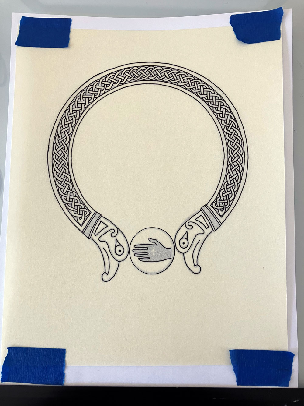
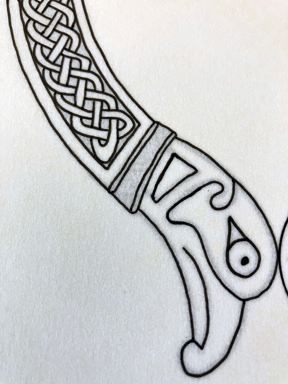
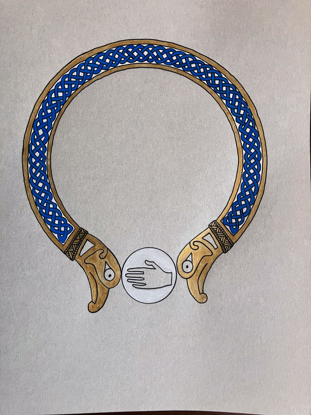
I knew how I wanted this scroll to look overall right away, but not necessarily what form the knot work should take. So, I dug out my collection of Celtic design books and found the perfect example in part of a larger piece by Courtney Davis from Celtic Borders & Decoration. The original terminals looked like upside down dog heads to me, so I swapped them out for right side up bird heads to represent the Northshield griffin and suspended the award badge between them.
I’ve heard that, when painting scrolls, it’s best to work either from lightest color to darkest, or the other way around. Since most of my work is done with a single brush and white is so easily contaminated by any other color, I decided to start with that, then moved on to the gold. I follow that up with an overlay of details on the terminal collars in micron pen. The knot work was done in blue to match the primary color on the recipient’s personal device.
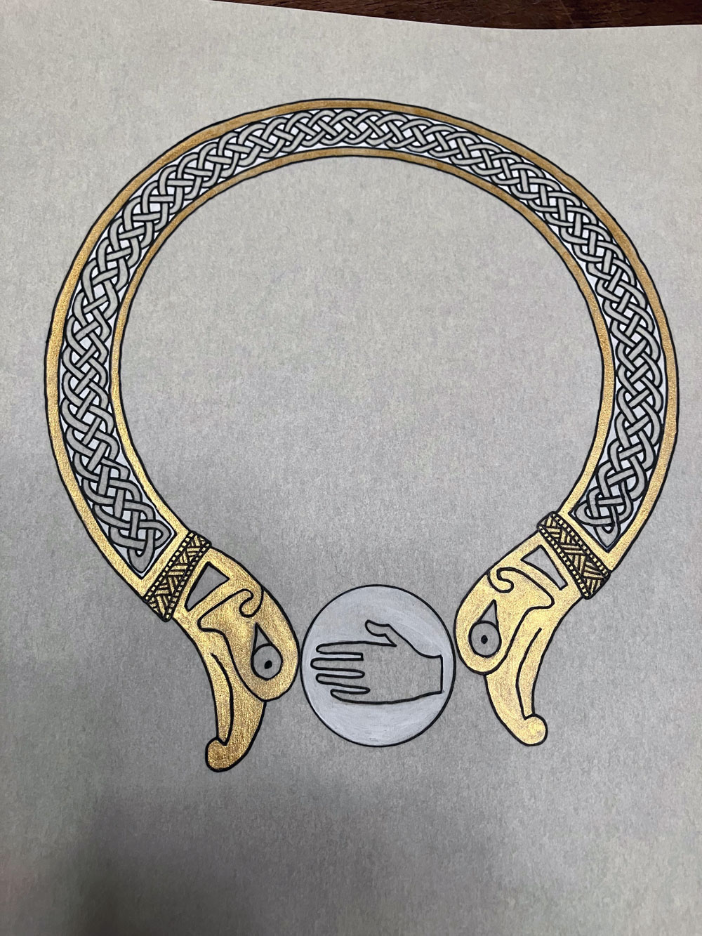
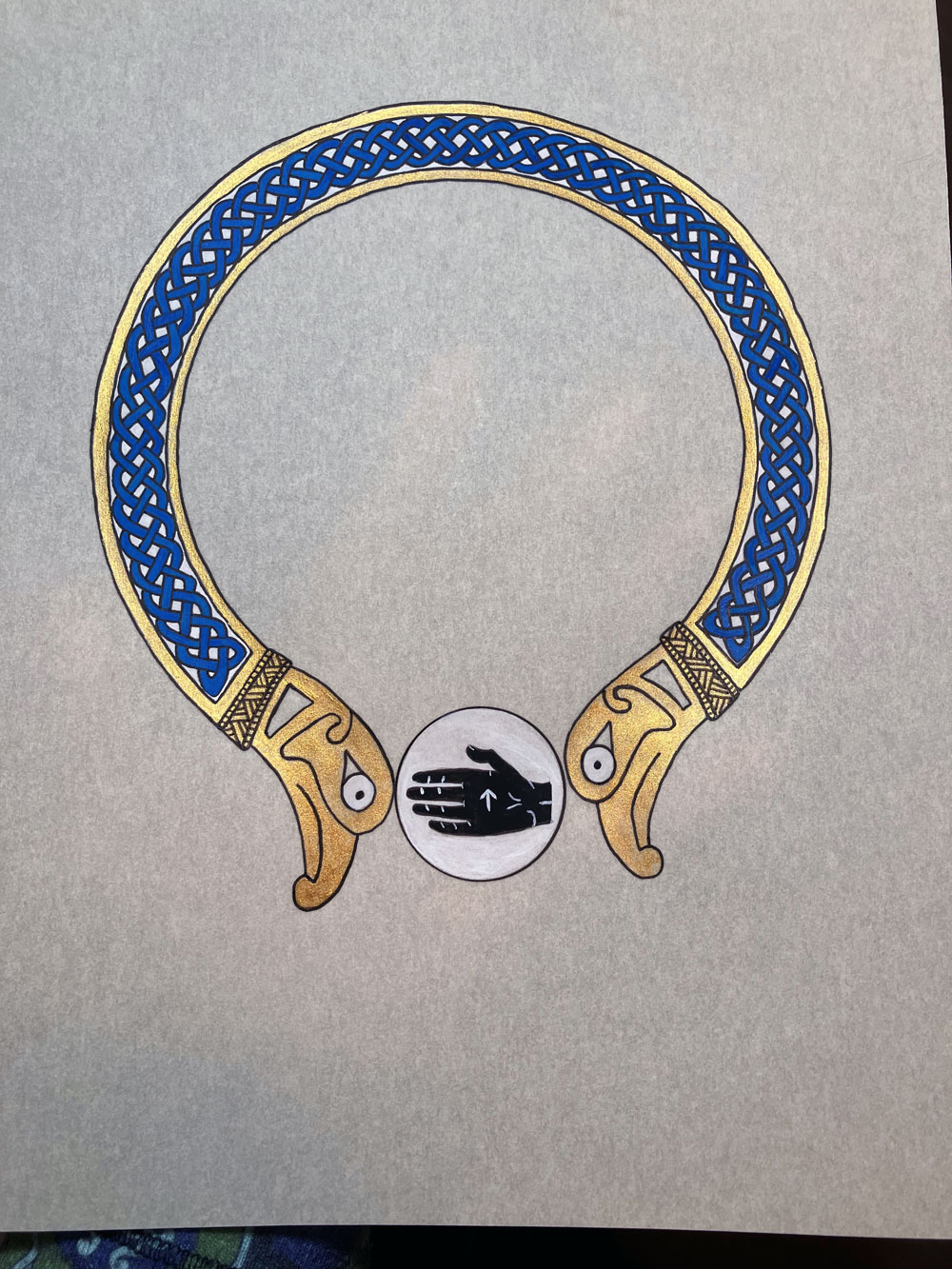
After the black went into the hand and the white work detail on top, I decided to paint the whites of the birds eyes, too, to give them a bit more presence. I placed the torc a little high of center to allow for seal and signatures to be placed below it, but the Carolingian Miniscule text took up less room than anticipated and they ended up going inside the torc instead. My takeaway here is that I still need to get better about recommending the placement of seal and signatures for when I’m not in the room when it happens to achieve the best overall balance.
Materials: Printer, 8″x10″ pergamenata, ruler, Ames lettering guide, pencil, eraser, 05 micron pen, metal scraper, Finetec gold paint, Winsor & Newton gouache, Princeton heritage 2/0 round paint brush, Speedball Super Black ink, dip pen