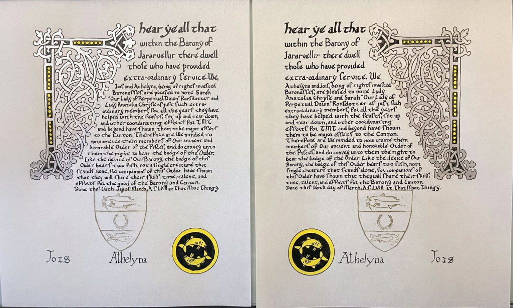
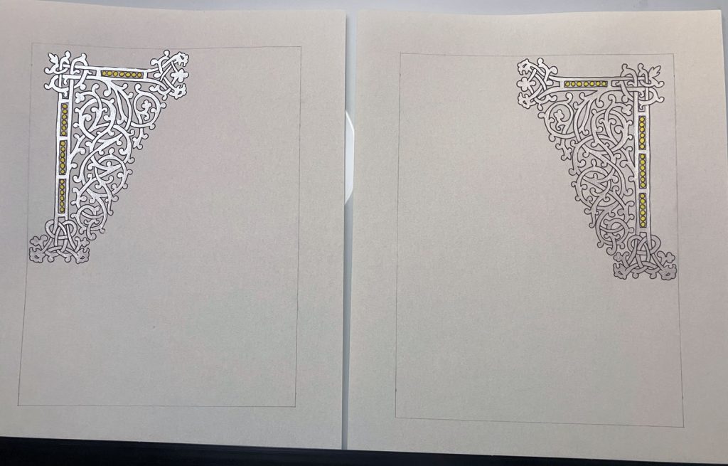
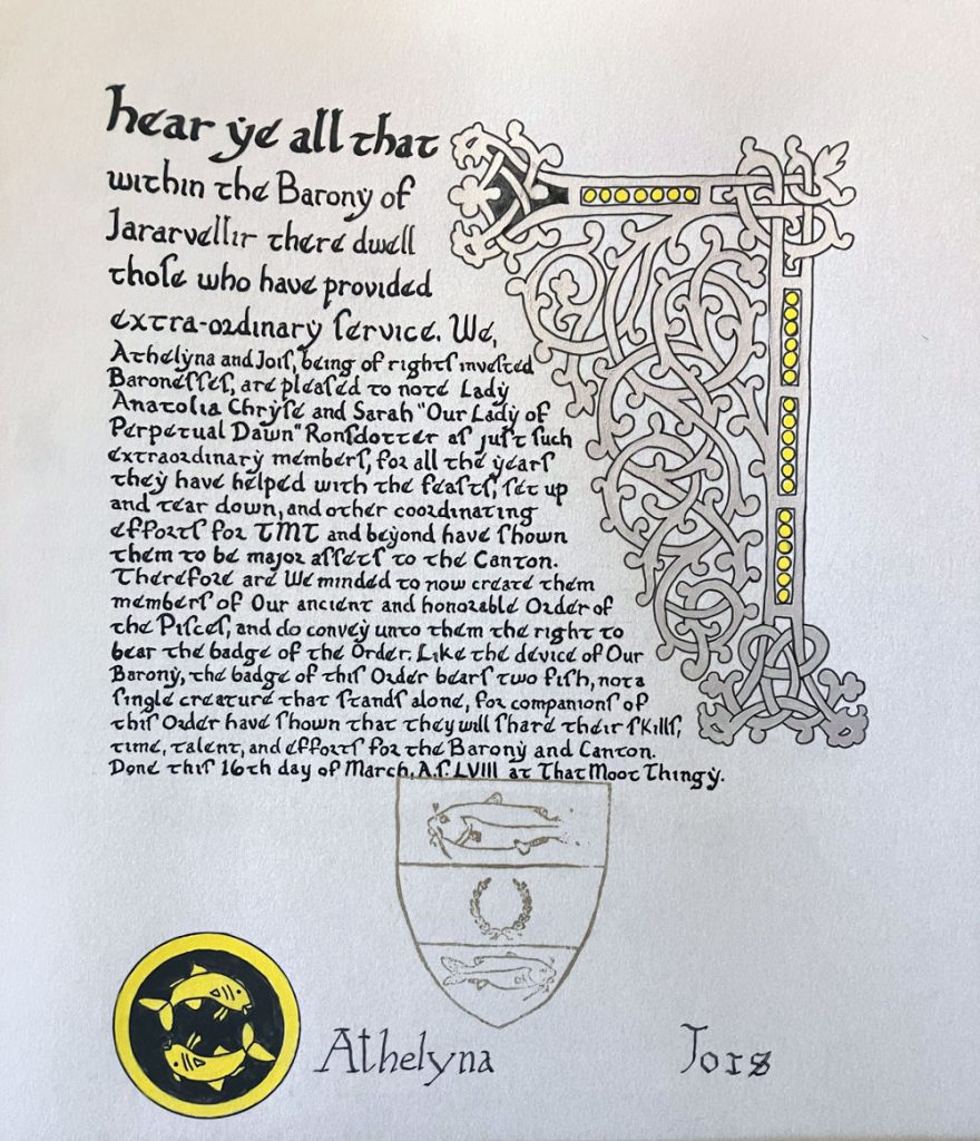
I was happy for a chance to use this template again. I loved it the first time around except that the word flow was awkward to place. So I decided to flip it upside down to see if that fared better that way.
It was definitely easier and I liked how it filled the page, but there wasn’t enough contrast with the silver so I took the scrolls back briefly to add some contrast to the outside sections. I didn’t dare add contrast to the entire filigree area for fear of ruining it. I would have really loved to have done this scroll on black paper, but haven’t figured out how to get a clean transfer of a complex template yet. Also, I’m still clearly struggling with leaving enough room for large stamps.

Materials: Printer, light table, 8″x10″ pergamenata, ruler, Ames lettering guide, pencil, eraser, micron pen, Speedball Super Black ink, dip pen, gouache, Finetec silver paint


