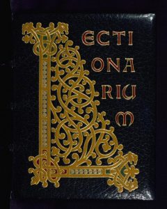
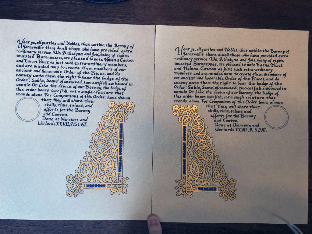
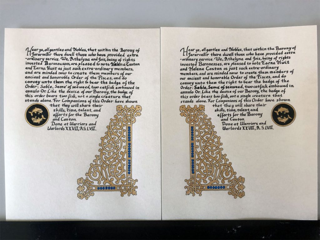
The Order of the Pisces is an award that is always given out in pairs. This binding for a medieval lectionary book called out to be chosen for this project.
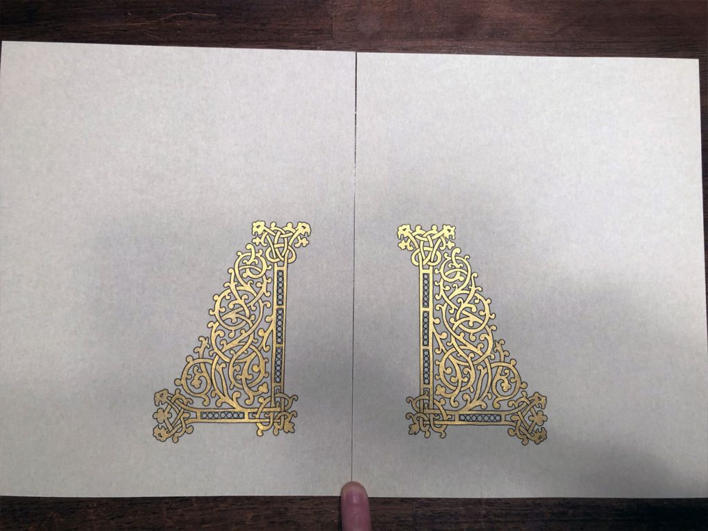
One of these days I need to learn how to properly edit in Photoshop because I spent far too much time pixel editing that image into a serviceable template, but it was worth it in the end. Flipping it on the light table for one of the scrolls resulted in a lovely bookend set.
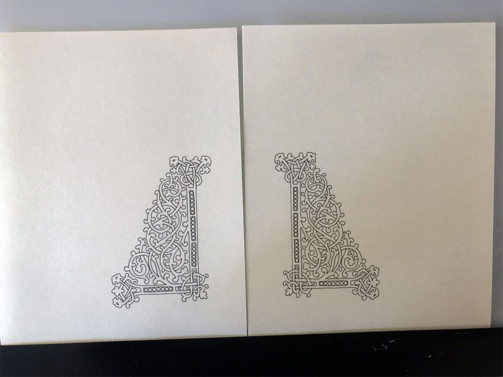
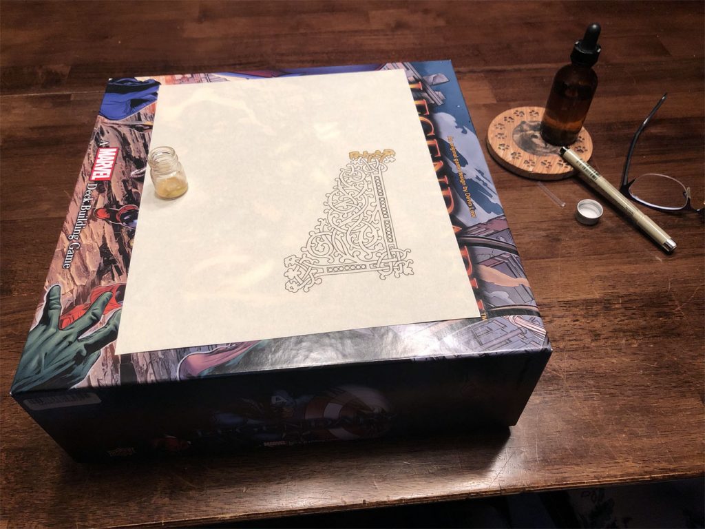
Putting the scrolls on a box for the gilding saved my back and neck enough pain that I think I’ll use that process again in the future.
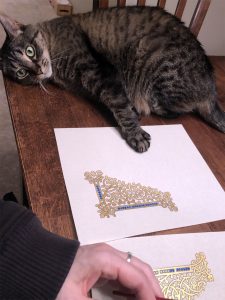
Look at that beautiful shine! In true period fashion, sometimes the cat wants to be involved. These scrolls are Nina approved.
Arranging the flow of text around imagery is tricky. Sometimes word length doesn’t cooperate though, in period, the scribe would simply break the word wherever the last character landed in a line and continue on the next line. This was likely done more because paper was expensive and white space was wasteful rather than out of a sense of artistic aesthetic but it gave them an aesthetic advantage. Also, they likely drafted out the entire page before setting ink to parchment. Something to consider for future scrolls. Also, I still need to work on better control of ink flow just after the dip.
Materials: Printer, light table, 8″x10″ pergamenata, ruler, Ames lettering guide, pencil, eraser, micron pen, Speedball Super Black ink, dip pen, gouache, Finetec gold paint

