These scrolls were based on a page from the Doffinnes Hours, a manuscript produced in the early 15th century. I love how the design is both intricate and simple at the same time. It took me a while to clean it up in Photoshop, but it was completely worth it. That shark pie thing (?) in the lower left corner got swapped out for the award’s badge.


The first parts of both scrolls were the same, but changing the colors on the primary bits resulted in two very different effects. The one on the left pulls focus to the blue berries for an up/down feel while the one on the right pulls to the badge and red bar for a left/right feel. I also took the opportunity to use a couple of my new metallic paints, putting gold on the left one and silver on the right.


One of the reasons I chose this design was because of how well it fits with the words, done in my favorite hand, Chancery Italic.
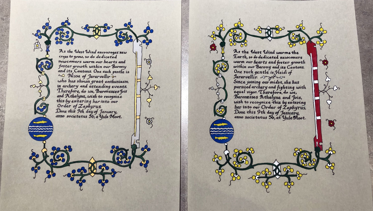
Materials: Printer, light table, 8″x10″ pergamenata, ruler, pencil, eraser, Ames lettering guide, circles template, micron pen, Speedball Super Black ink, dip pen, gouache, gold and silver metallic paint