
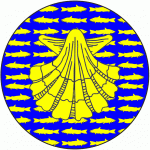
My first official scroll was a baronial award for the Order of the Gilded Shell. The recipient was a professional jeweler with a persona from the Tudor period. The badge of the order is Azure semy of catfish, an escallop inverted Or, which looks like this:
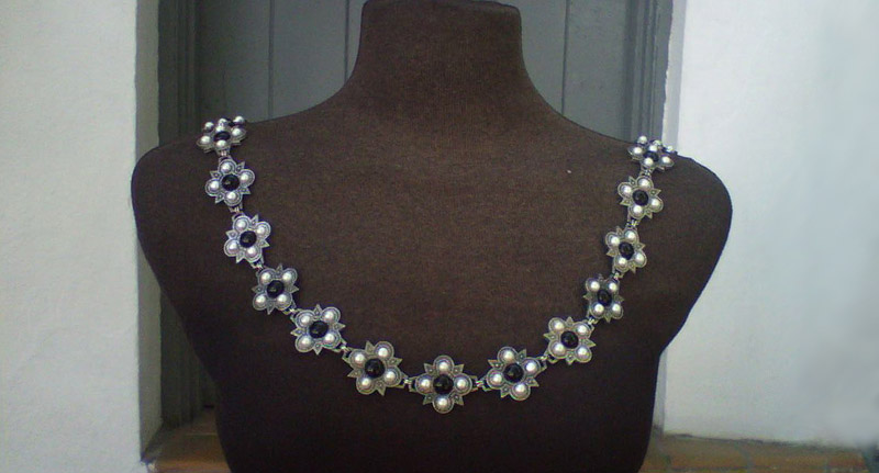
Can you hear me laughing hysterically? No way was I going to try to draw, much less paint, all of those tiny background fishes. I did want to incorporate the shell though, and I had an idea. I found this beautiful reproduction Tudor necklace online and decided to use it as the border. (I’ve since lost the source, unfortunately. If you find it, please let me know so I can link to it!)
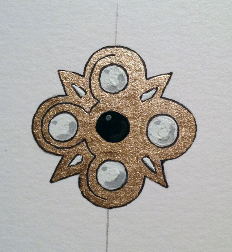
I went to my friend Jois with the idea, and she painted this test piece for me to work from and with that I got started.
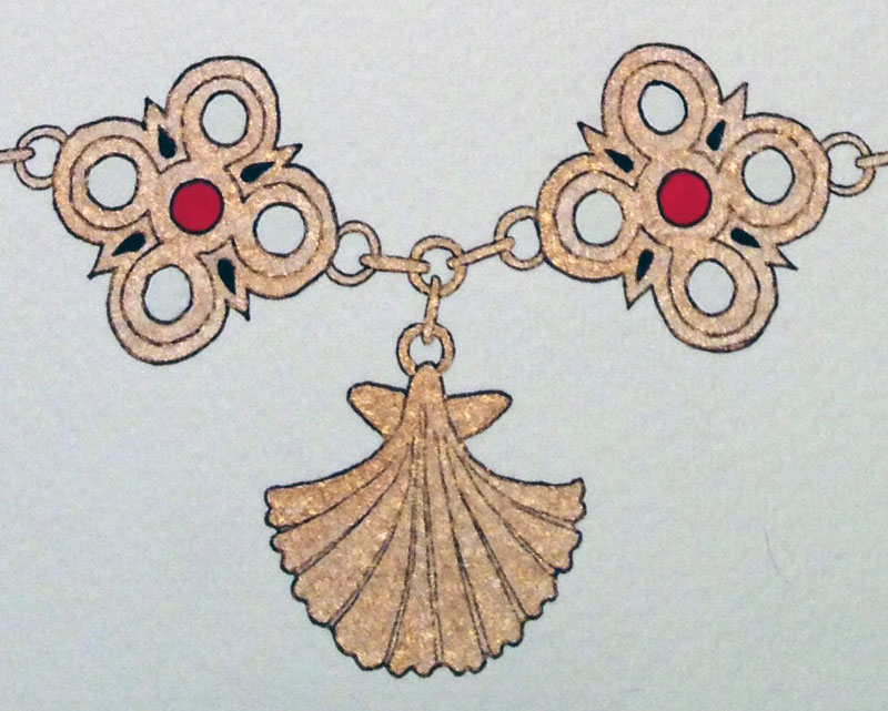
With extensive use of a ruler, pencil, and eraser, I marked a line one inch from the top to be removed so the overall scroll would fit nicely into a standard picture frame. Marking framing lines one inch in on all sides from there, I used a ruler to plot it all out evenly, then put in four points for each jewel (again with the ruler), drew the arcs from point to point, then added all the remaining lines around it. Doing the foundation work with the ruler made drawing the lines “freehand” a LOT easier. I placed a simple jewel at the top as a sort of representation of a clasp, and the shell at the bottom as a pendant. Then I went over it all with the micron pen and erased the pencil lines.
Again using ruler, pencil, and eraser, I picked up an Ames lettering guide to lightly sketch the lines for the calligraphy. A good flat edge to slide the guide against is critical. I did not have one and it resulted in much swearing and erasing of lines that suddenly decided to take left turns when the guide jumped the ruler. Since I wanted the words to be legible, I chose Chancery Italic as my first hand as it seemed very approachable for beginning calligraphy and was one of the hands in the booklet that came with my calligraphy set. After inking the text, I again erased the pencil lines.
The next step was to link all the pieces of the necklace together with micron pen, add the color, and then go back over some of the lines with the micron pen again that had gotten painted over.
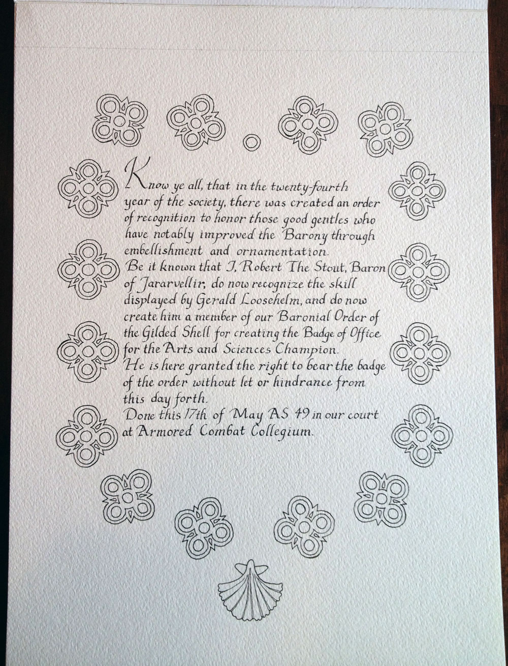
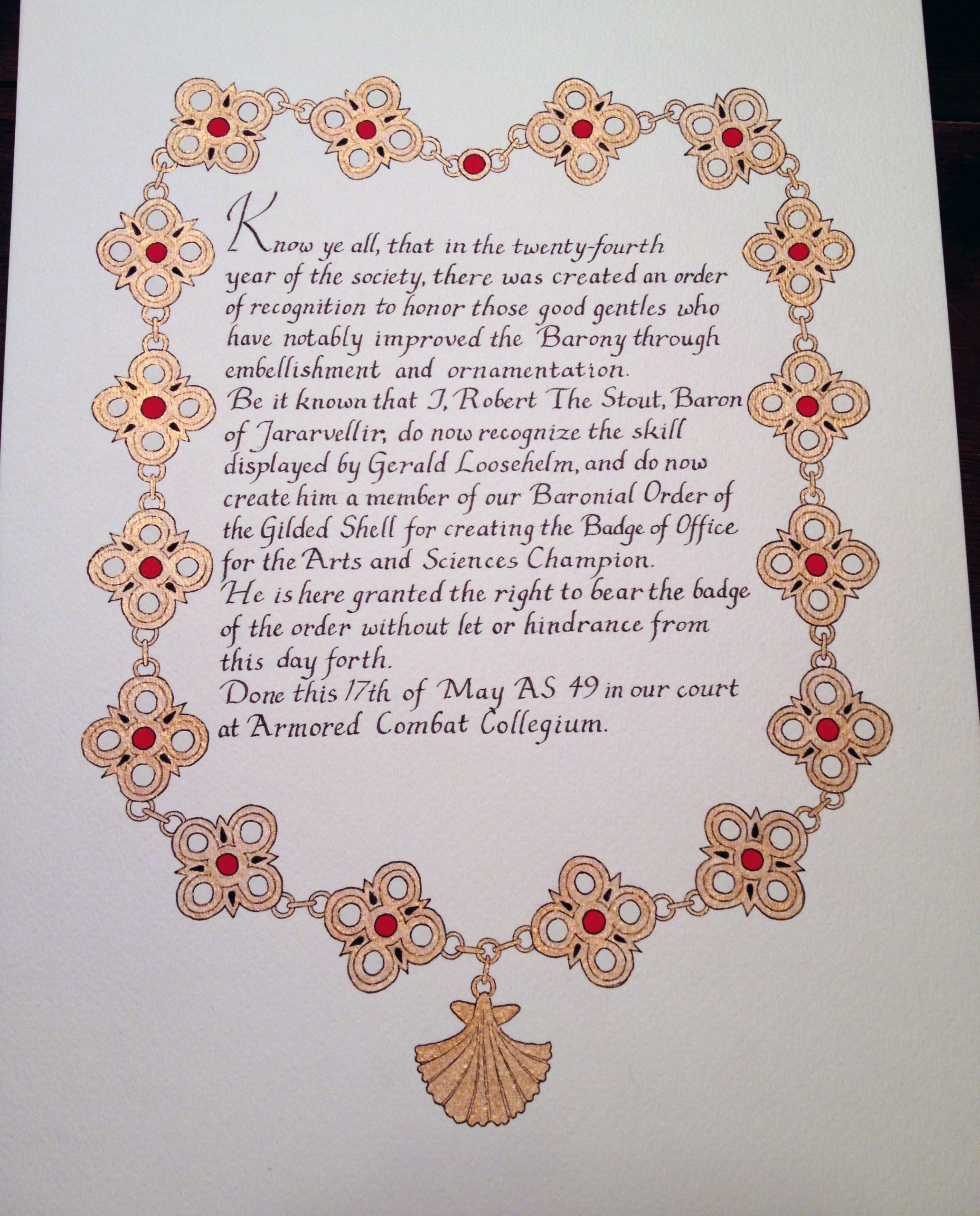
By the time I got done with the basic colors and the gold, I was too scared to try a second layer to add dimension to the gemstones, so I stopped. Eight years later, I wish I had done the calligraphy one size smaller to allow a buffer on the sides between it and the necklace, but it is still one of my favorite scrolls.
Materials: 9″x12″ Bristol, ruler, pencil, eraser, Ames lettering guide, micron pen, cartridge ink fountain pen, Winsor and Newton gouache, unknown gold paint from Jois