
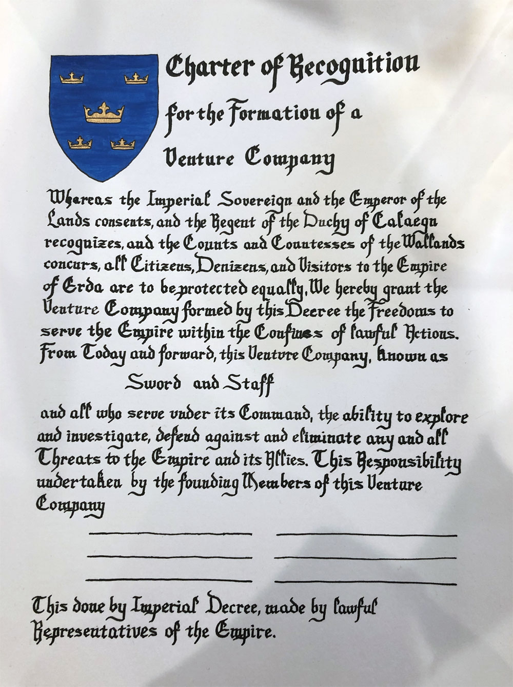
This one actually goes between 17 and 18 in the timeline. I am VERY slow to adopt new calligraphy hands. This was my first shot at Gothic Foundational. It’s legible, but part of the reason I tend to avoid complex lettering is because it’s very difficult to do well in a small size. I did this scroll a while ago and no longer remember if I used cartridge ink or dip pen. I thought I’d used cartridge to eliminate the need to concentrate on ink flow, but the fading of the ink followed by a sudden increased darkness and thickness of the lettering toward the end of line two and in later sections are signs of dip.
Materials: 11″x14″ Bristol, ruler, Ames lettering guide, pencil, eraser, Speedball Super Black ink, dip pen, micron pen, gouache, gold paint