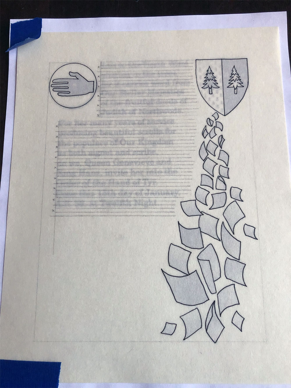
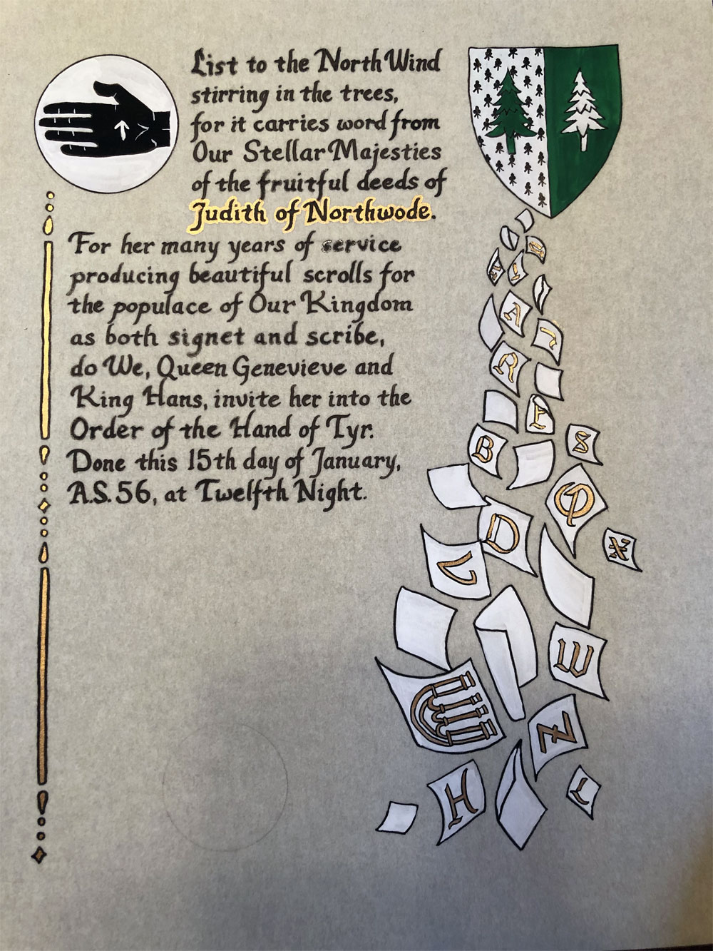
This pair of scrolls was a serendipitous opportunity I couldn’t pass up. I received the Kingdom level assignment from Clydwyn first and got to work. Judith was being recognized for producing a lot of scrolls over the years and her profile page invited scribes to experiment with scroll design. I decided early on that I wanted to fill the page with scrolls, though I was a bit daunted at the prospect of how to execute it. When I saw her device, I knew exactly how it needed to happen. The pages needed to be falling out of it in a cascade and, since they were spilling out, some of them would be back side forward, thereby reducing the overall amount of tiny painting required.
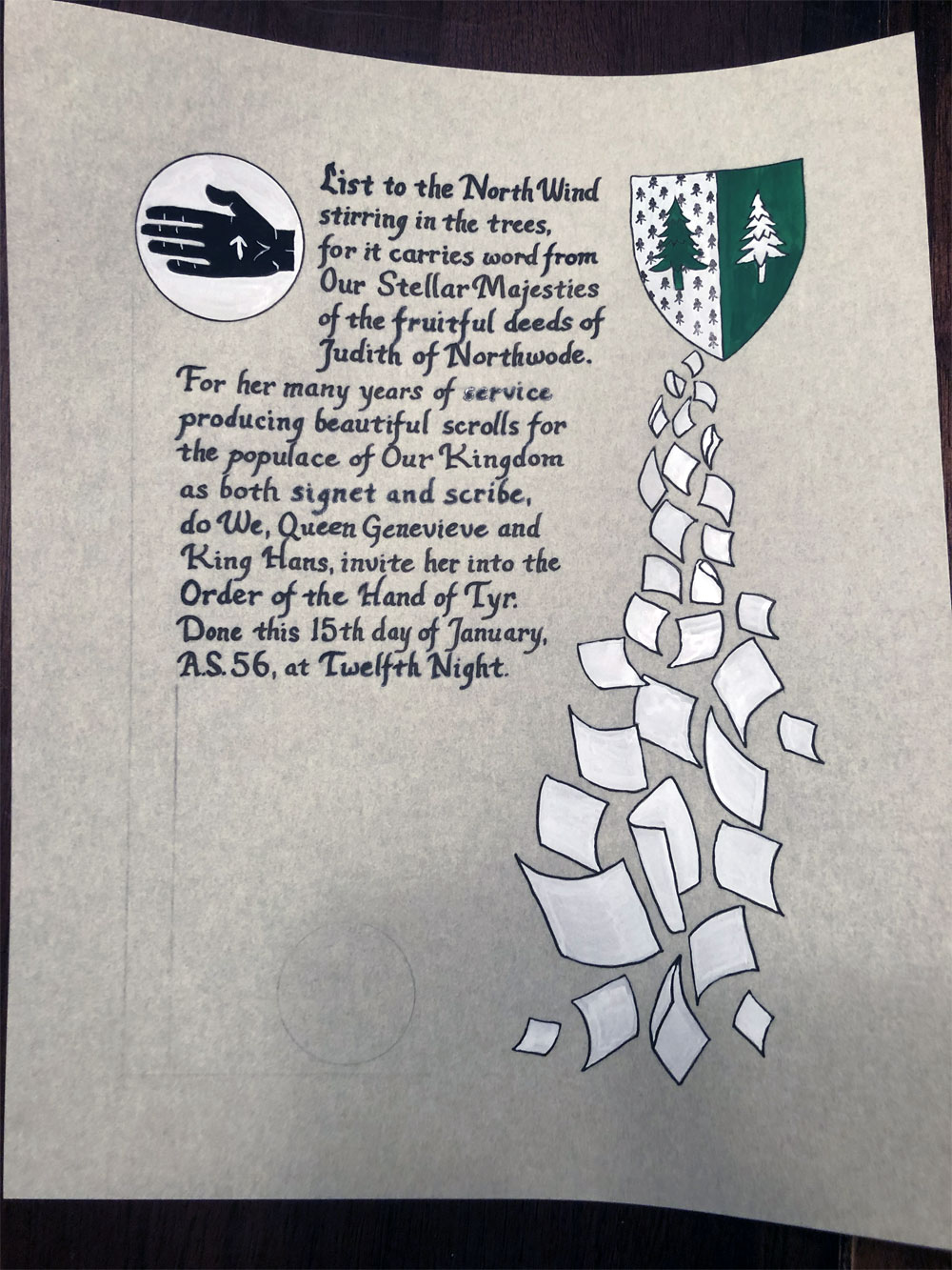
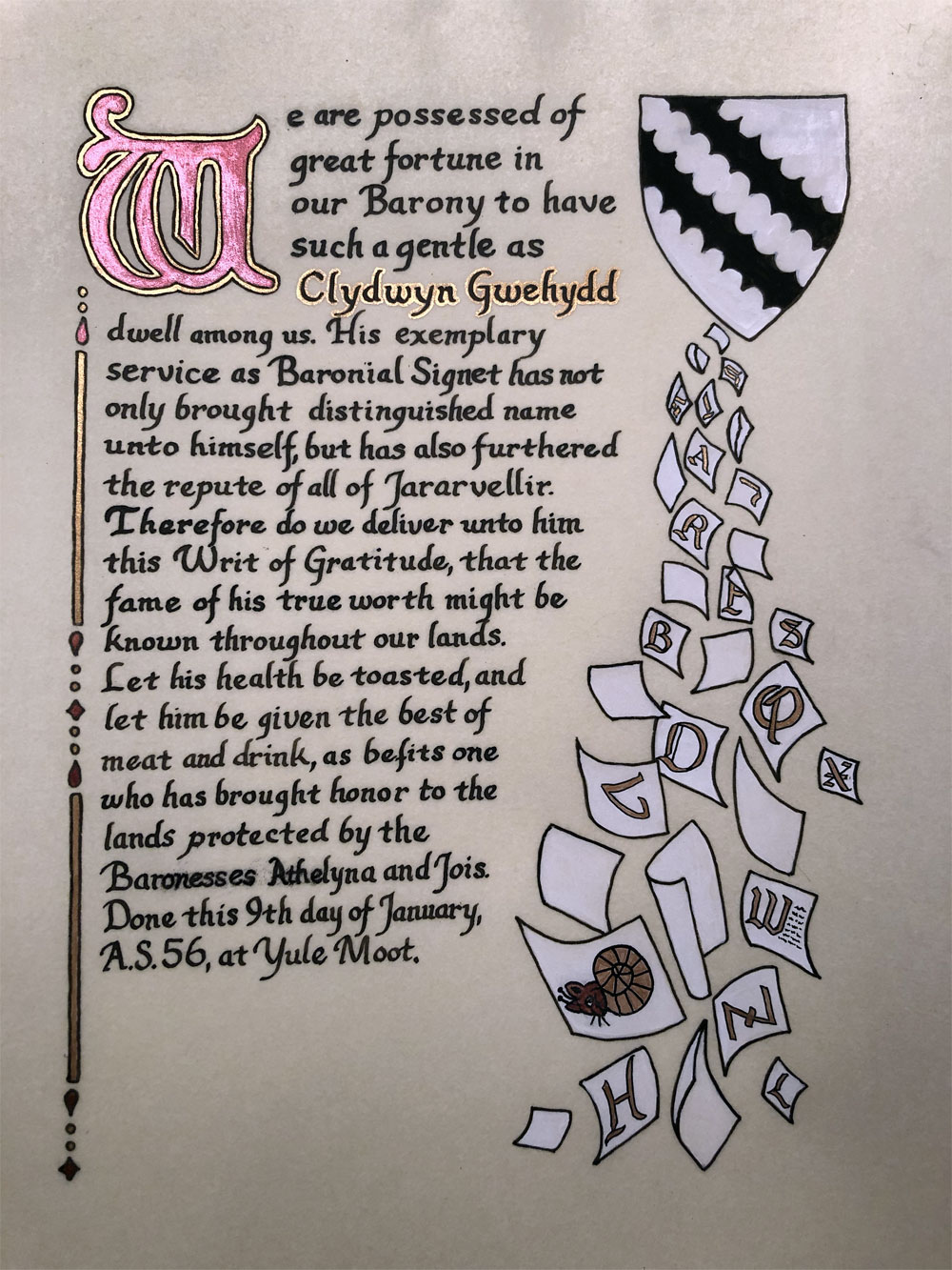
Somewhere between image one and image two, I received the second assignment, which was to do a Baronial level scroll of the same type of recognition for Clydwyn, the person who had assigned me Judith’s scroll. I found a beautiful period style design, worked up the template, and got started.
And then I sent a progress picture of Judith’s scroll to Clydwyn, who gushed over the design. I knew what I needed to do. I set the second scroll aside and went back to the light table.
So now I had two scrolls of similar design and still had to figure out what to put on the actual pages. I decided that the best course of action was to use illuminated letters on most of them and then have one accent scroll. As it happened, the last scroll I was awarded had been done by Judith. So, for her accent scroll, I painted a miniature copy of the scroll she had done for me.
Clydwyn’s deep and abiding love of marginalia was something I had already factored into the original scroll design, so I simply transferred the snail cat to the new one for his accent. The cat head was chosen in particular as a nod to his cat, Tom Bombadil. Then, after noticing that I’d accidentally done the W on his background scroll off center, I added some tiny text scribbles to play it off as a representation of the scroll on which it was embedded. I wish I’d been smart enough to think of doing that on purpose, but I love it nonetheless.
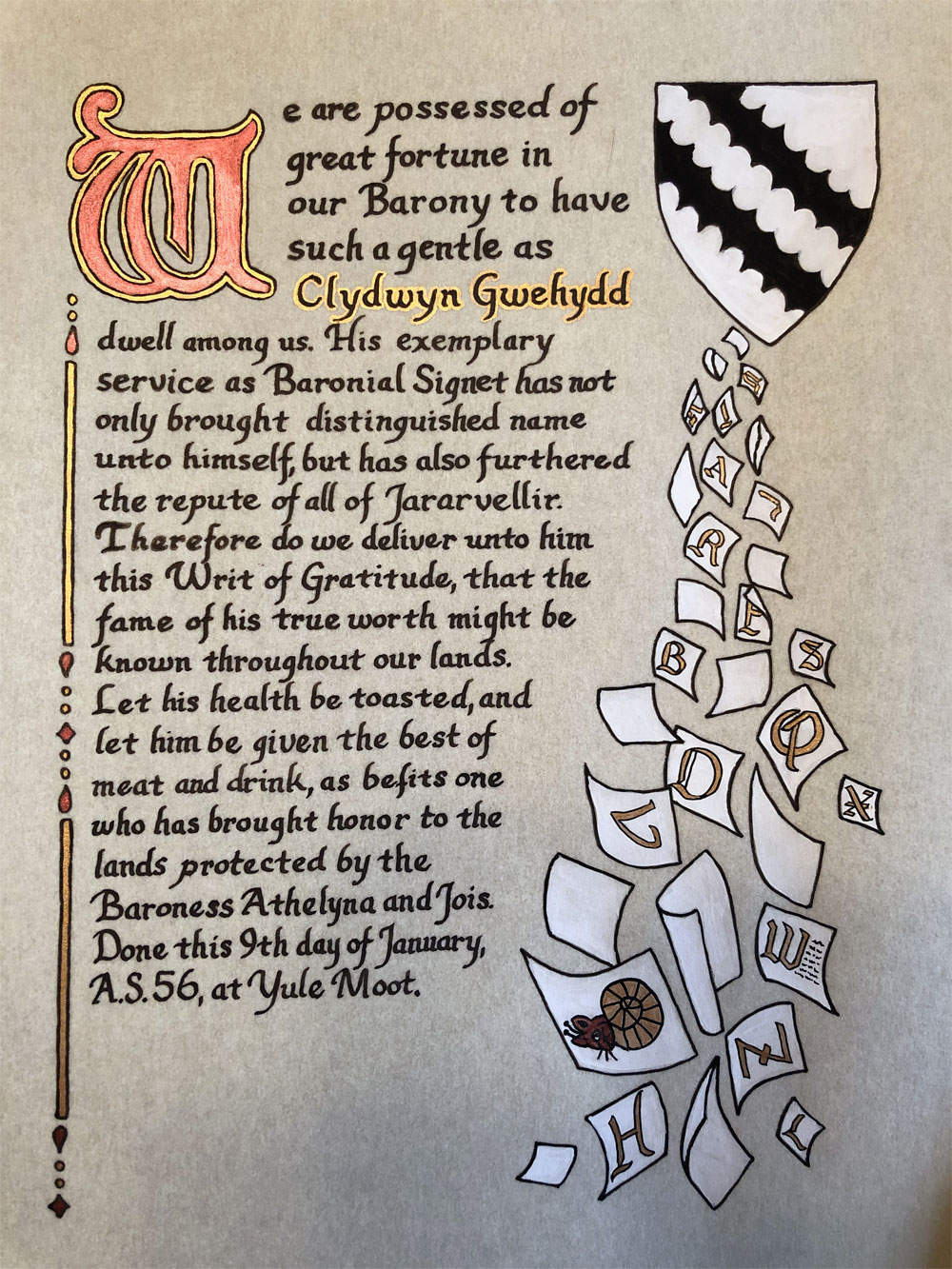
Unfortunately, my calligraphy hand got ahead of my brain yet again and I misspelled Baronesses. Perg to the rescue! I feel like there’s still opportunity for improvement on perg corrections though.
Materials: Printer, light table, 8″x10″ pergamenata, ruler, pencil, eraser, Ames lettering guide, circles template, micron pen, Speedball Super Black ink, dip pen, gouache, gold and red metallic paint