
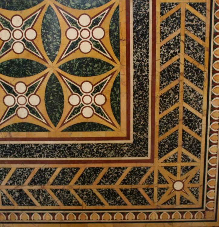
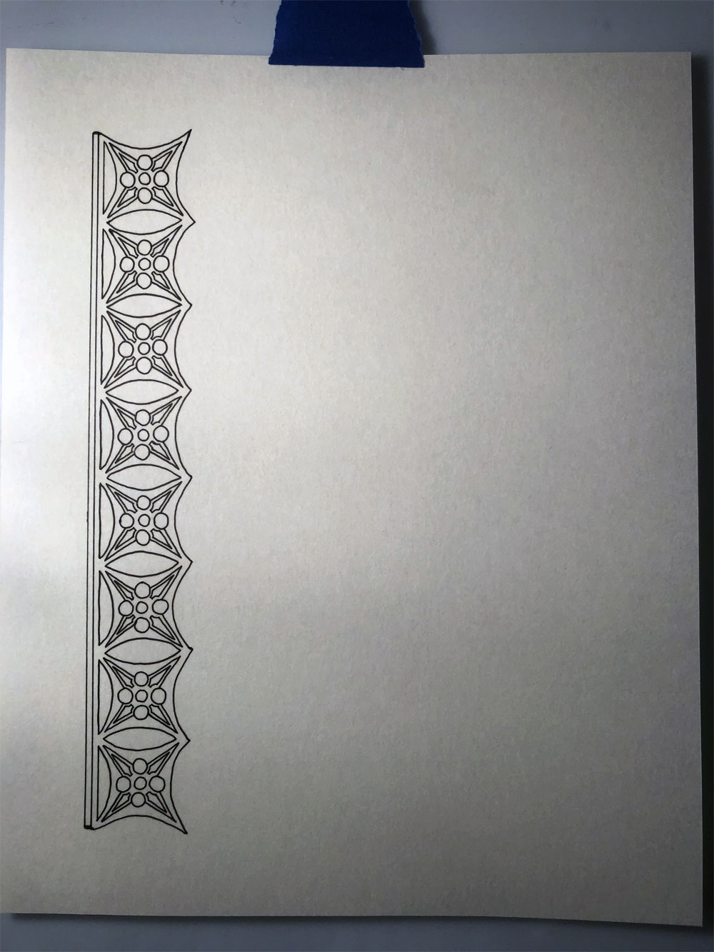
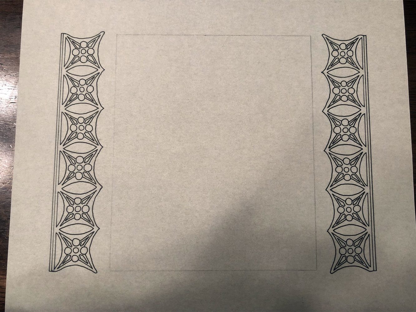
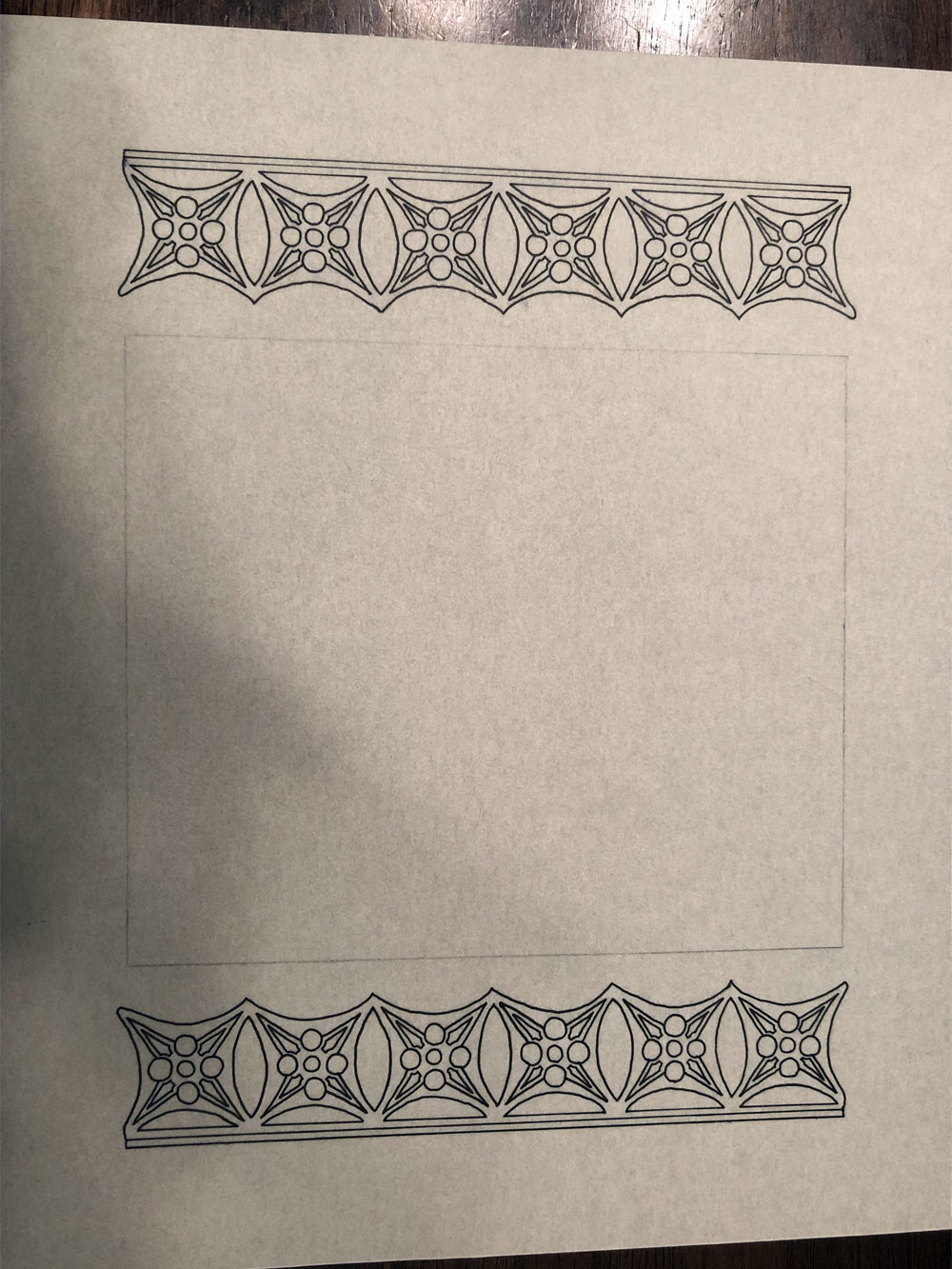
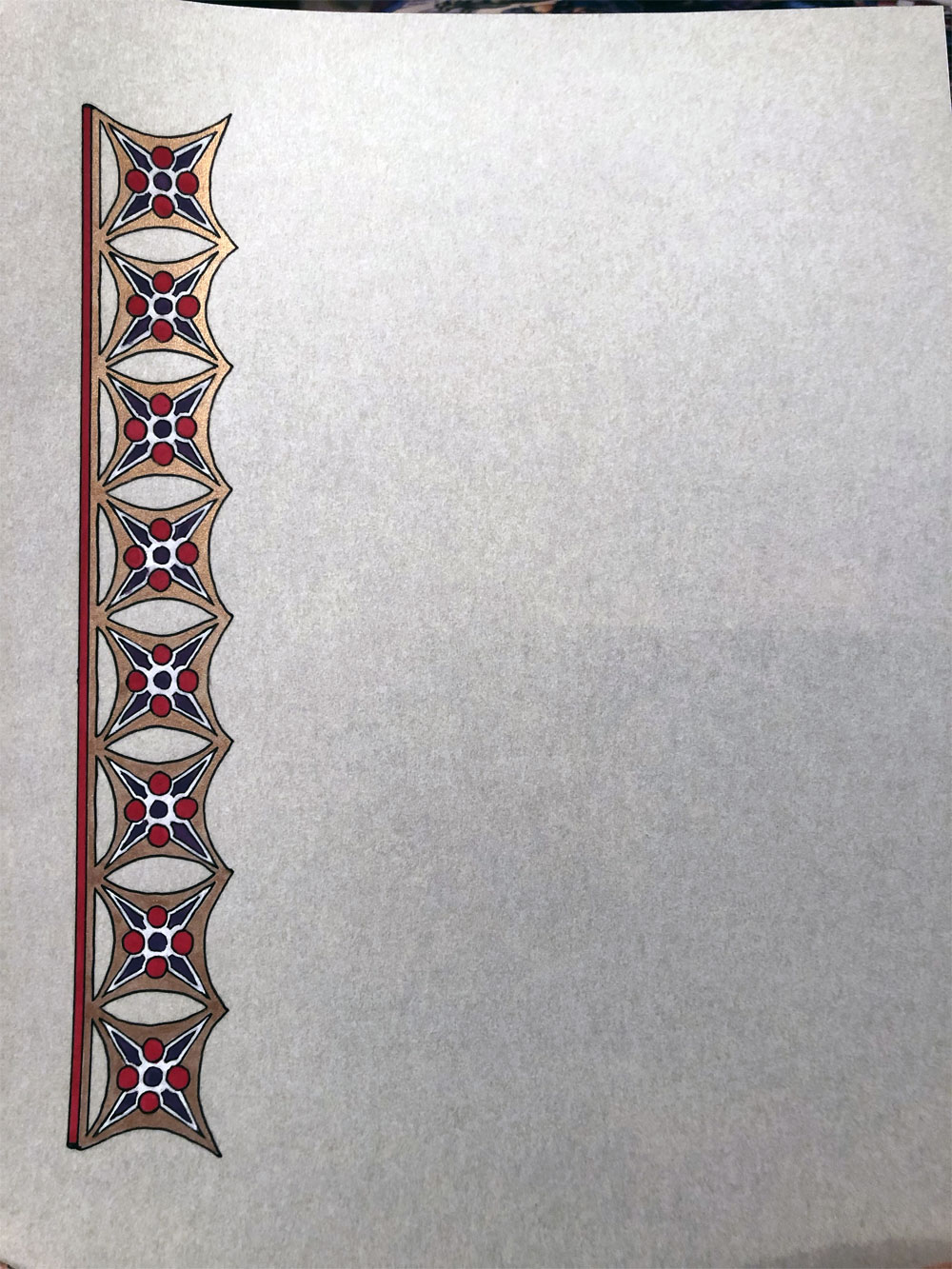
I really liked the inner section of the mosaic I’d found in the opus sectile mosaic, so I adapted the motif for another pair of scrolls.
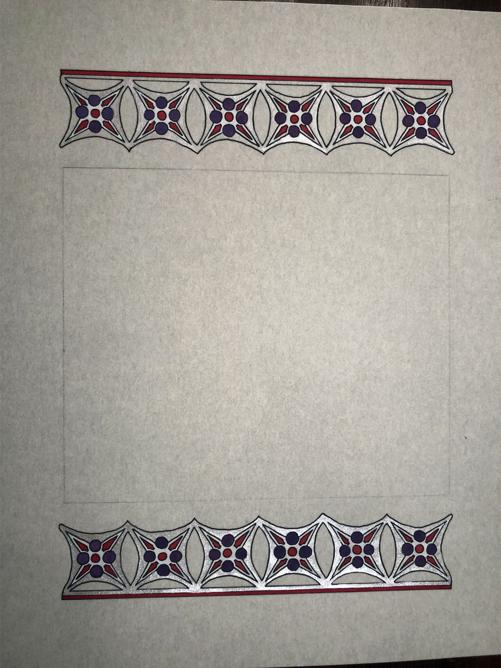
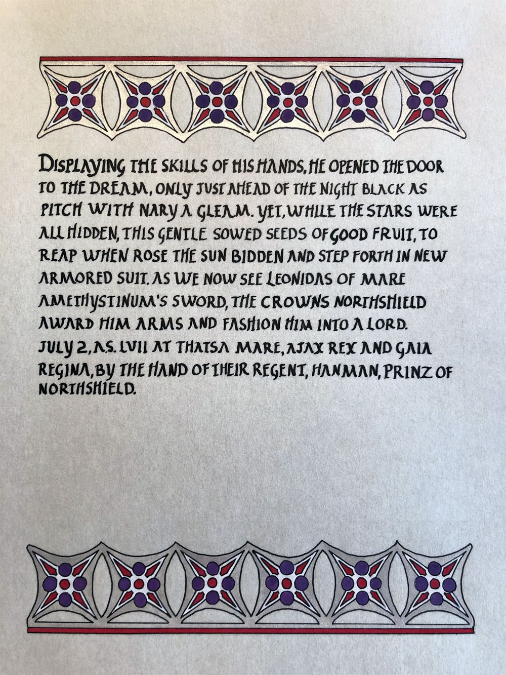
Rather than a full border this time, I opted for a more open look and, after finishing the outlines for the second one, decided it needed to be turned to portrait mode.
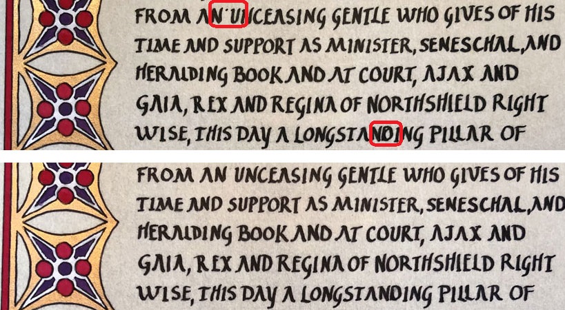
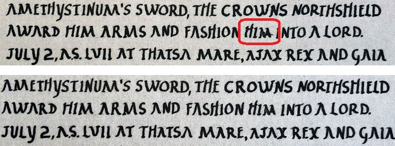
I haven’t really talked about why I do the outlines first. Some people do them last, which has the advantage of allowing the lines to follow where the paint went and even hiding slightly uneven paint lines. That generally means sketching the whole thing out in pencil first which is a step I do in Photoshop instead because, while I am great at tracing, I’m not great at freehand drawing. I also like having clearly defined lines that won’t smudge to use as my guide when applying the paint. It means I have to be more careful with the brush, but I have a fairly steady hand for that. Still, I do occasionally slip over a line but it’s easily corrected by reapplying the line and, in the case of perg, a bit of judicious scraping where required.
Sticking with the sitting royal’s red and purple colors, I chose silver for one of the scrolls on a whim instead of my standard gold. Then, unsure if I’d somehow ruined it because it had such a different effect on the overall tone, I posted a progress picture on social media hoping to get some positive feedback. I often worry that my scrolls are too simplistic. I also worry about ruining a scroll by trying to put too much on it. Less is more is where I live, but sometimes it’s hard to know if I’ve done enough, especially when I’m not reproducing a scroll as closely as I have done with others. However, a friend pointed out that “there aren’t any illuminated texts from the early Roman period. You are using art that did exist as inspiration and translating it into a different form. This is literally creative Anachronism.”
So, not ruined then. Whew. Onward to calligraphy in Roman Rustic! I spent extra time crafting the words to get some metered rhyming into them, but I couldn’t write small enough to get them to line up visually, so it’s a bit of an Easter egg. An extra bit of illumination was also added to the gold scroll because, by the time I’d finished the blanks, a new court with an earlier deadline was announced. So, I simply pivoted them from their original intended purpose.
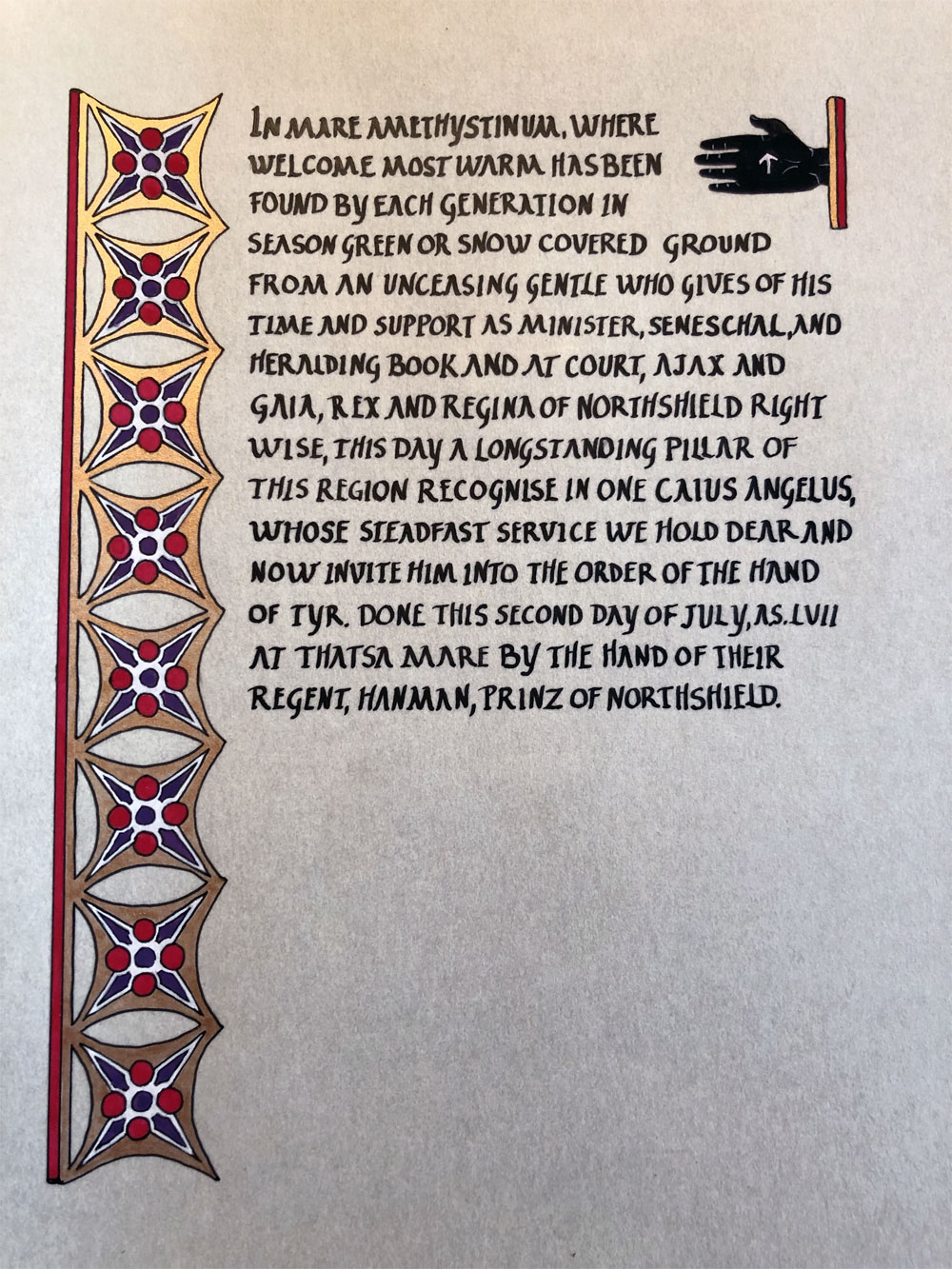
This is one of the reasons I like to do the illumination first. The other is that the illumination takes the most effort. It’s much easier to correct minor errors in the calligraphy and save a scroll from ruin. Like so.
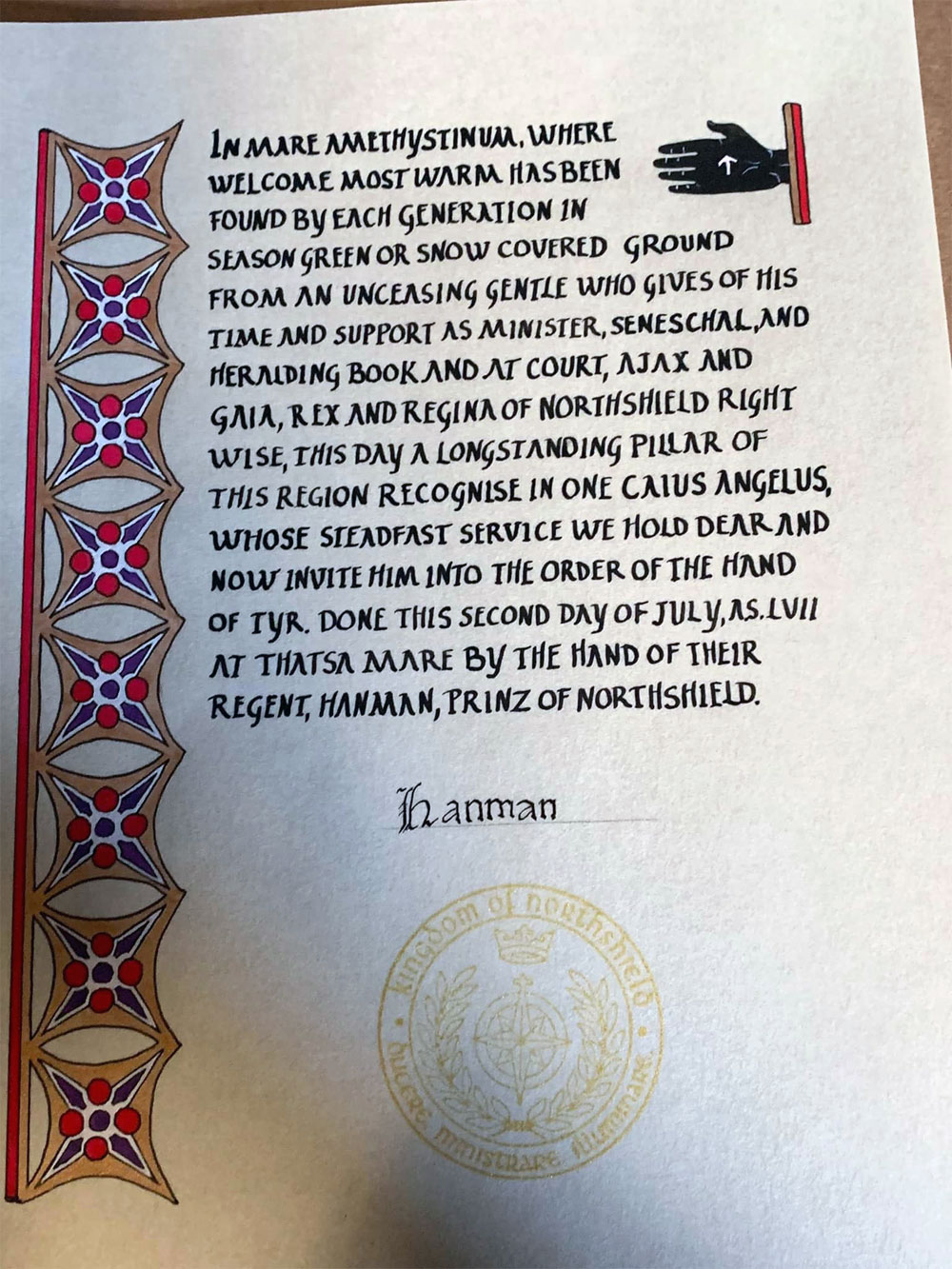
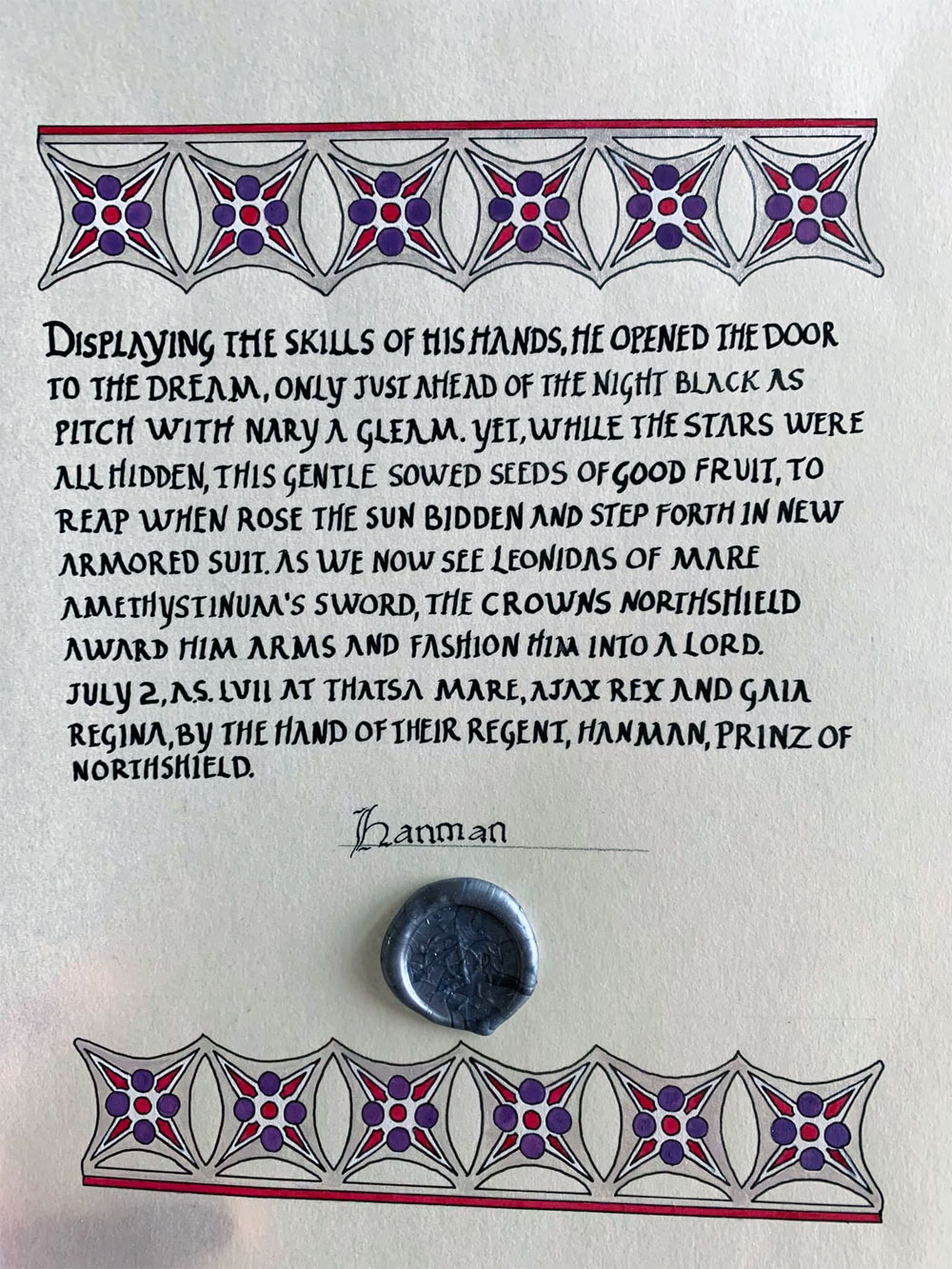
Materials: Printer, light table, 8″x10″ pergamenata, ruler, Ames lettering guide, pencil, eraser, micron pen, Speedball Super Black ink, dip pen, gouache, gold and silver paint