
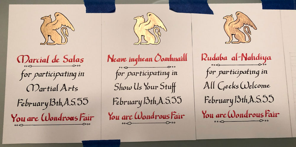
I loved the simplicity of these note cards. By this point, it was becoming clear to me that minimalism was my style. In part, I genuinely love a clean look but, if I’m honest, it’s far easier for me to do than complex scrolls. I also love complex scrolls. I just haven’t developed the patience or confidence to do them justice.
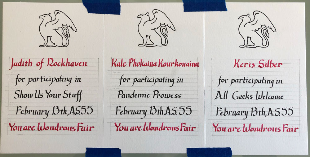
I sneaked a few Uncial capitals into the Chancery Italic calligraphy…
…and tried out a new gold paint, which was very pretty on the page, but smelled horrendous in the bottle.
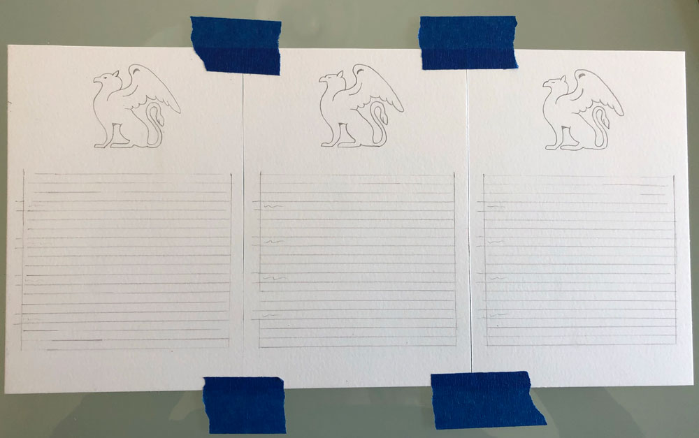
Materials: 4″x6″ Bristol, light table, ruler, pencil, eraser, Ames lettering guide, cartridge ink fountain pen, micron pen, foul smelling gold paint
Around the same time, a call went out from another quarter requesting a flood of cards for a person going through an extremely difficult time. As the person had a Scottish persona, I chose a thistle for the imagery. The red text is a quote credited to the Bishop of Geneva, Saint Francis de Sales (1567–1622), but which I first saw in a yoga book. It had such an impact on me that I wrote it on a sticky note and affixed it to my bathroom mirror, where it has remained for five years.
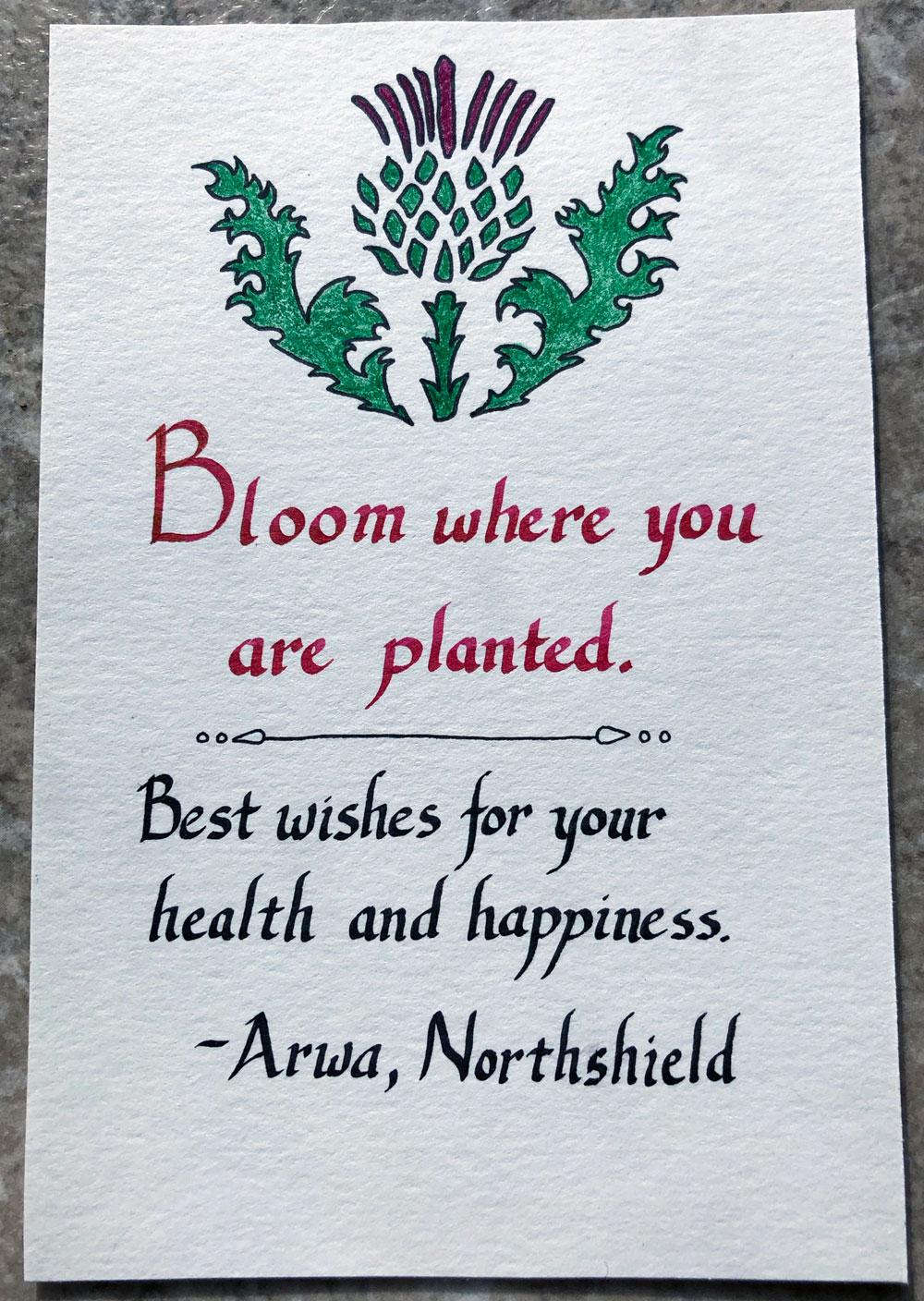
Materials: 4″x6″ Bristol, light table, ruler, pencil, eraser, Ames lettering guide, cartridge ink fountain pen, micron pen, colored pencil